Meto ApplyMCF - Scholarship Application Portal
Streamline the scholarship application process for students and expand university visibility to high-potential applicants.
Role
Web Design Intern
Team
Individual
Duration
June - August, 2023
(8 weeks)
Tools
Figma
Procreate
Context
“Meto ("mee-tow”, Latin for "gather") is an ed-tech nonprofit with a simple goal: increase access to higher education for African students, and do it at scale. ”
— Meto Inc.
You can check out the Meto official website through this link.Problems
1
Prospective
Students
need an application landscape when exploring MCF-funded university opportunities, making it difficult to navigate and apply to multiple programs efficiently.
2
'ApplyMCF' is a concept proposed by Meto to the MasterCard Foundation, aimed at establishing a streamlined platform for students to apply for scholarships at MCF-funded university programs in collaboration with Meto. This design proposal showcases the platform’s potential to facilitate the application process and enhance collaboration between Meto, MCF, and partner universities.
Starting from scratch, I designed each page to be original, building upon Meto's existing visual system to ensure consistency in visual language.
As the solo designer, I crafted a user-centered experience tailored to applicants, university staff, and MCF administrators, supporting seamless application processing, admissions review, and fund monitoring.
Partner University Staffs
need an efficient way to review applicants and make informed admissions decisions.
3
Mastercard Foundation Staffs
require a centralized system to monitor fund distribution and track how universities are utilizing resources.
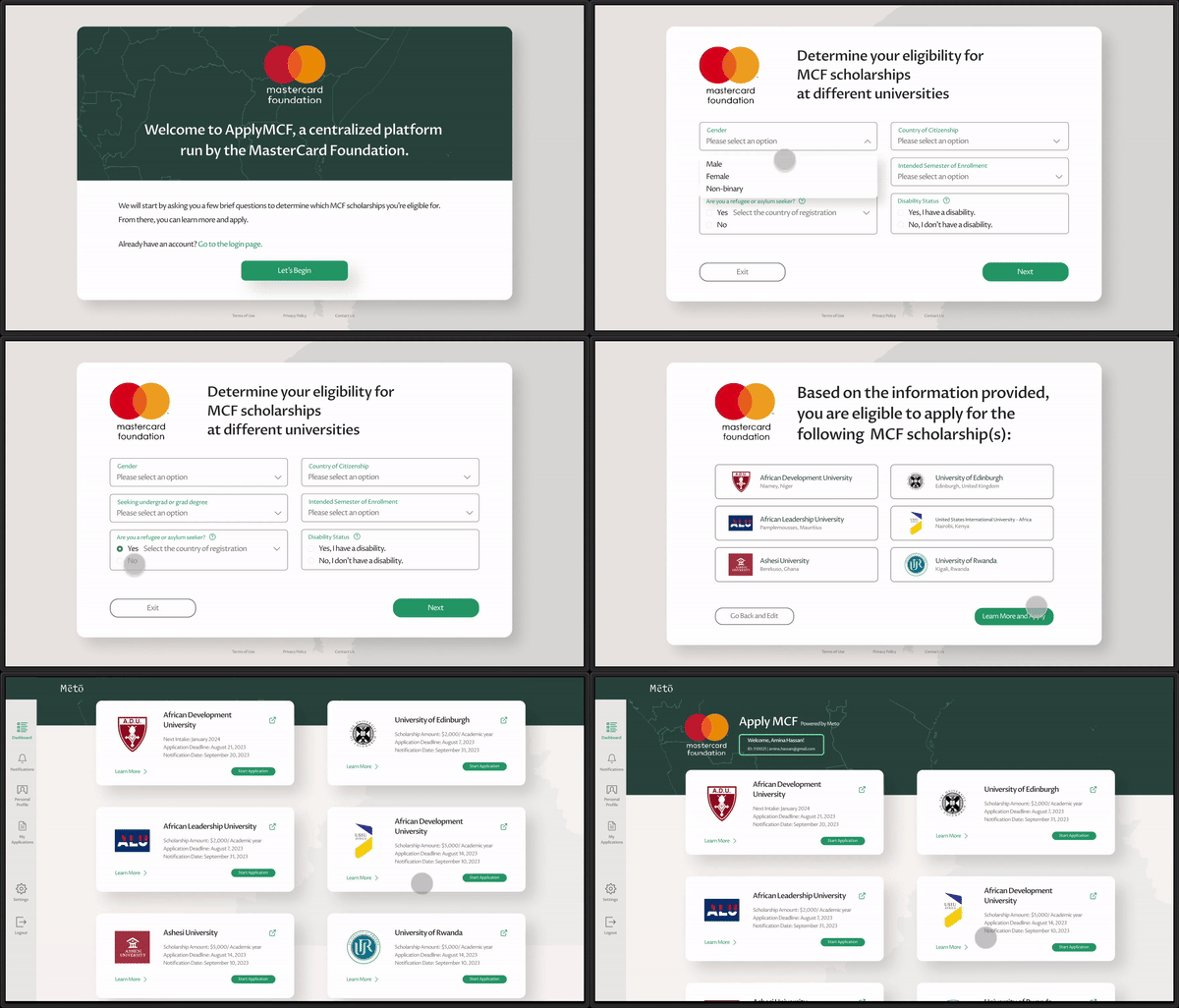
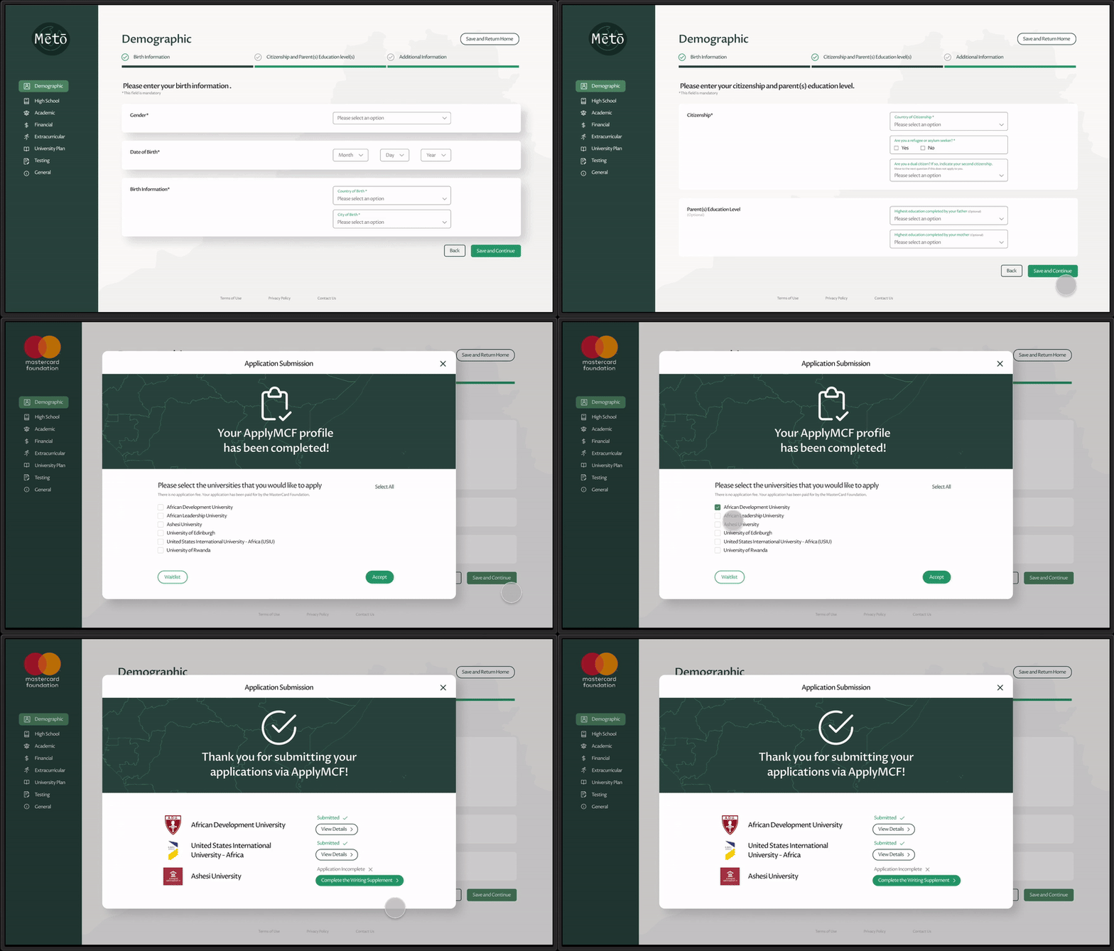
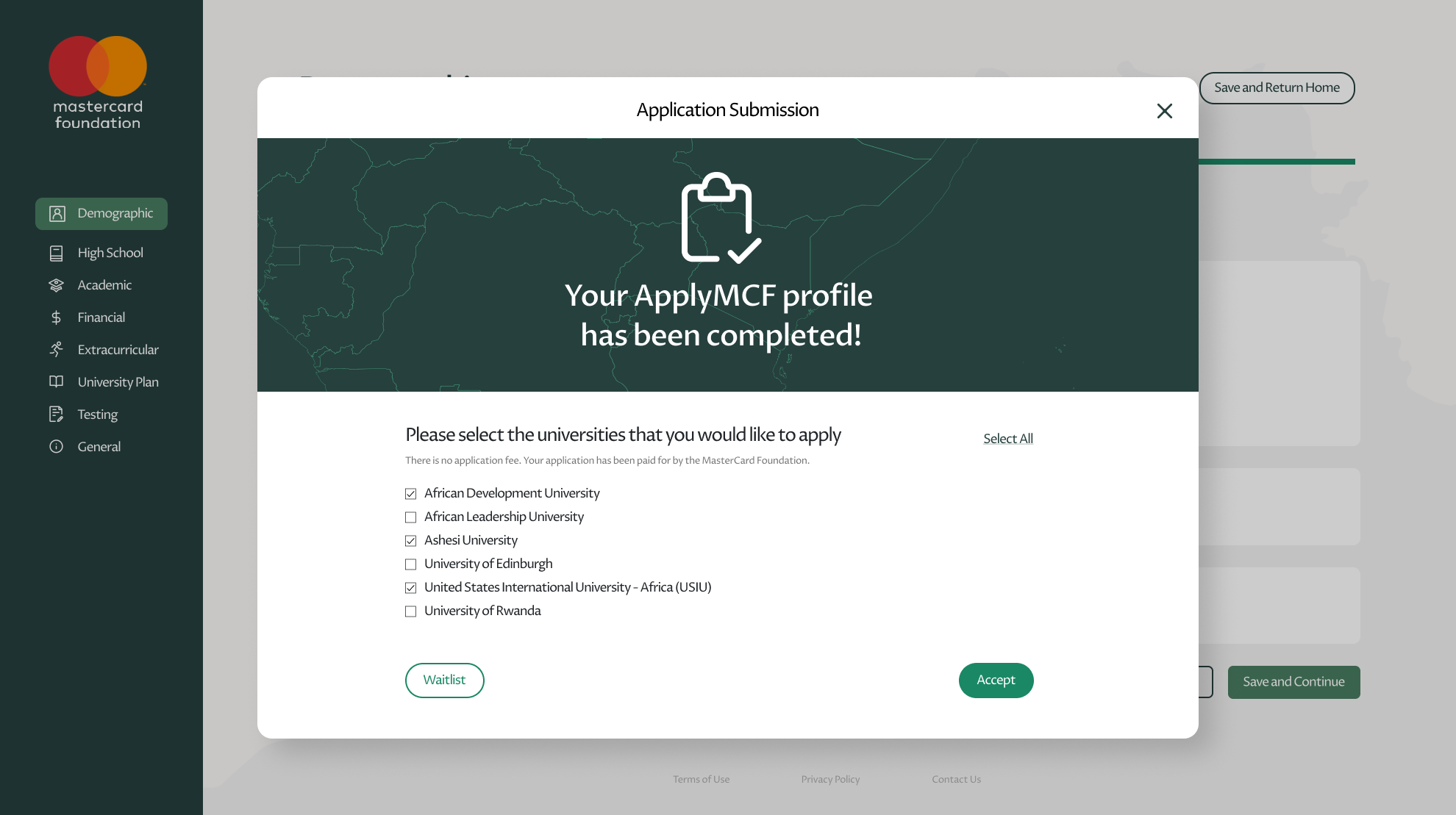
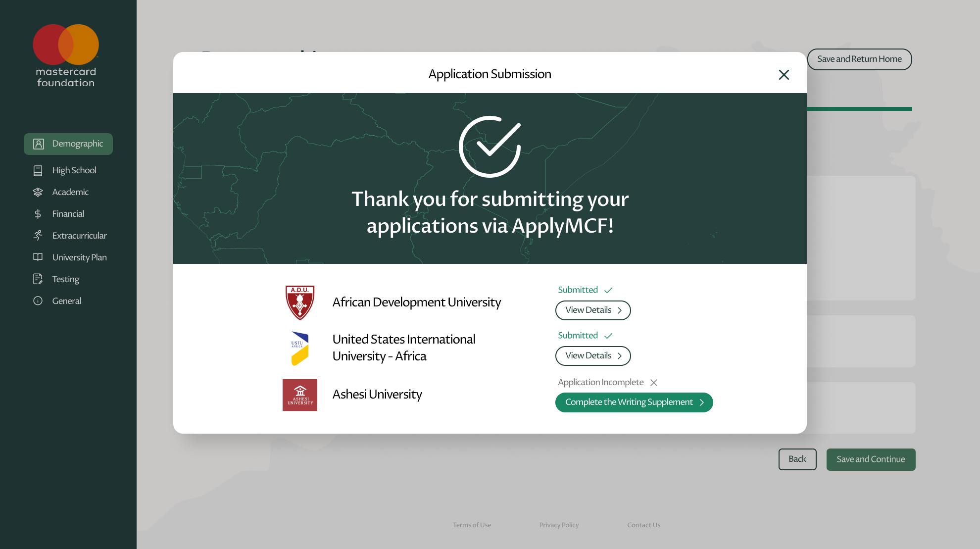
1. Student Scholarship Application
After learning about the available scholarship programs, users will be prompted to create their Meto accounts to start the application.
2. Apply MCF: Partner University Portal
Home
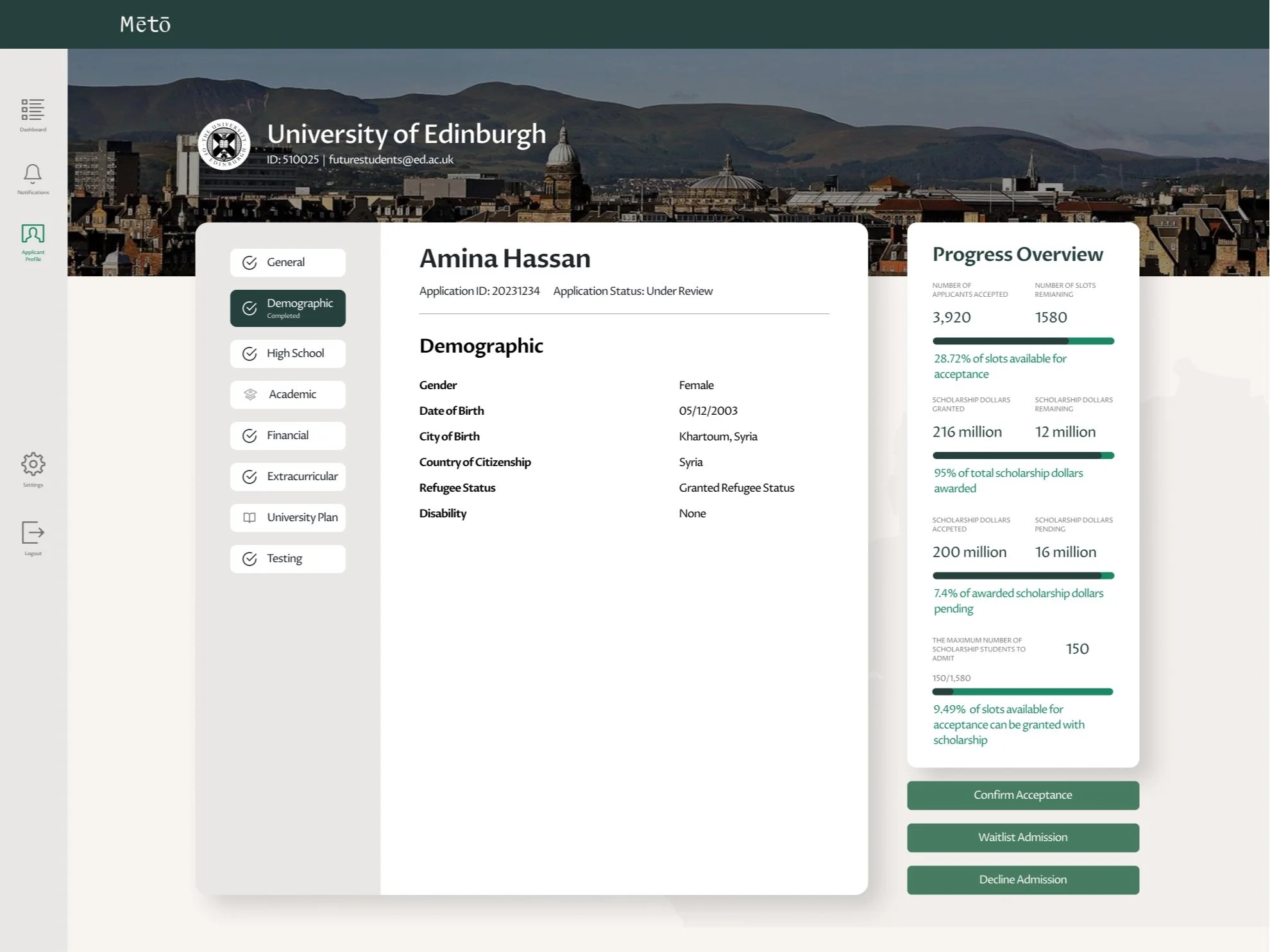
The page primarily assists partner university admission officers in monitoring their scholarship fund utilization while allowing them to quickly review updates from other sections.
Review Applications
Version 1
Cons:
Excessive vertical scrolling
Inefficient use of space
Decision buttons not immediately noticeable without scrolling
Version 2
Improvements:
Reduce vertical scrolling and improve decision button visibility by collapsing the 'Progress Overview.'
Final Version
Enhance central space usage by organizing different categories of a single applicant’s information into tabs.
Provide access to other applicants' information via the new left panel.
Improve the visual prominence of decision buttons.
2. Apply MCF: Mastercard Foundation Portal
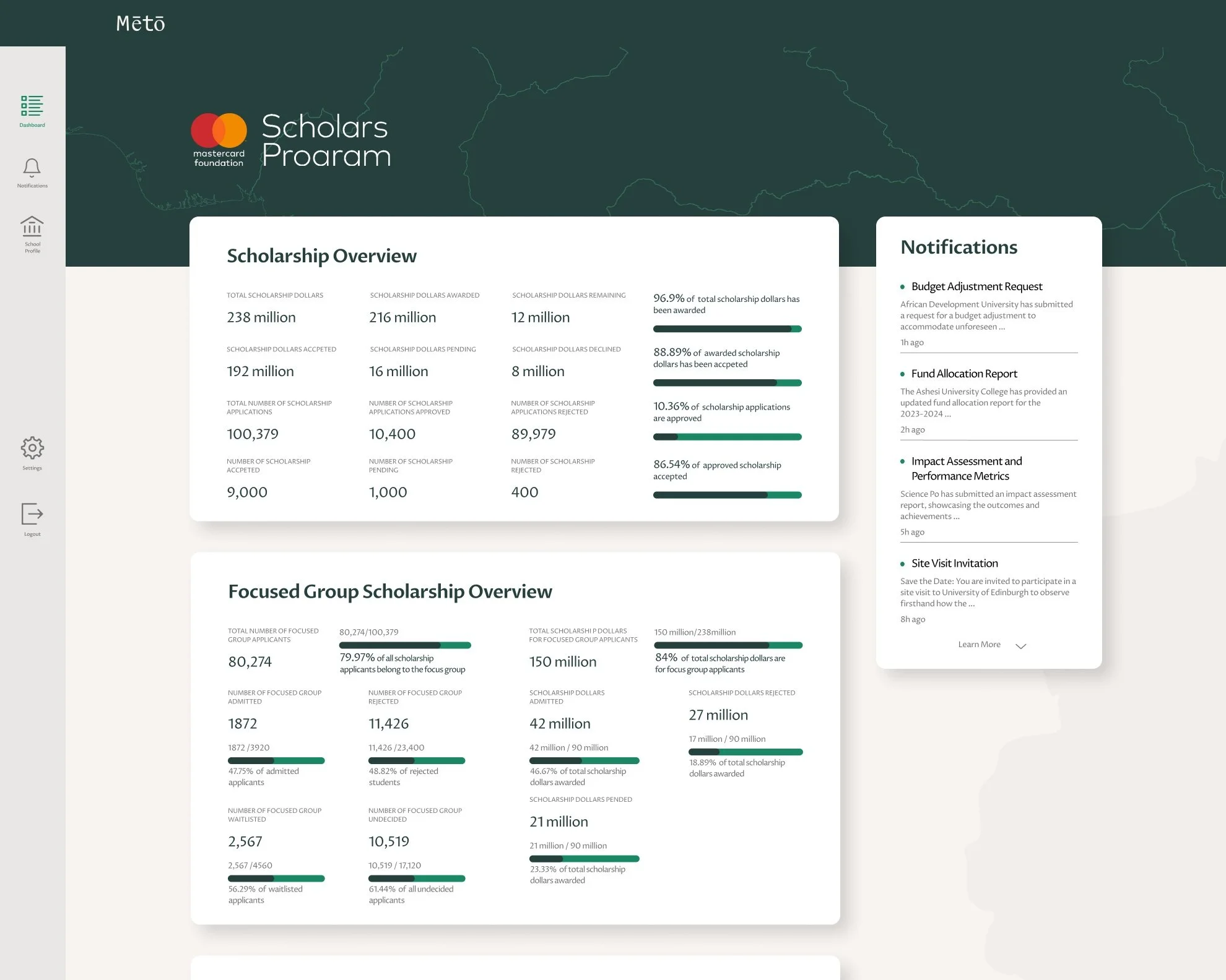
This interface provides an overview of the key data Mastercard Foundation uses to track the distribution of scholarship funding.
Dashboard
Version 1
Final Version
Version 2
Cards are condensed into accordions to prevent information overload and reduce vertical scrolling.
A greeting line has been added for users to verify their account and role upon logging in.
Version 3
The accordion is replaced by horizontal tabs to minimize vertical scrolling.
Numerical values are displayed in full numerical form for easier comparison.
Category titles are now in green to enhance visibility.
The narrow card on the side of the page serves as a summary of the latest notifications and offers access to the notification page for more complex tasks.
The title has been updated to 'Dashboard,' with the organization name displayed above in smaller font size for clearer page identification, which improves the visibility of system status.
The data categories on this page mirror those on the Dashboard, but the numbers here are specific to each partner university, enabling precise monitoring of fund utilization by individual universities.
Partner Universities
Version 1
Final Version
Con: Information Overload
Excessive vertical scrolling and Multiple tabs
Consolidate entry points to other universities' sub-pages into a dedicated University List page. This streamlines navigation, facilitating easier movement between detail pages of various universities as the Meto gains additional partners.
Replace accordions (data of different applicant categories) with tabs to reduce vertical scrolling to improve the accessibility of information.
Reflection
Throughout this project,
My primary focus was on enhancing the user experience through prioritizing visual clarity, refining user flow, and thoughtfully curating content for presentation. The iterations aimed to strike a balance by reducing steps while avoiding information overload on each page. The design of the user flow played a crucial role in enhancing the scholarship application process to minimize confusion. Equally important was the careful selection of content, particularly on dashboard pages where all data is presented, ensuring a user-friendly and informative experience. A key takeaway from these projects is the importance of backing all design decisions with a clear rationale.
If I had more time…
I would allocate additional resources to conduct more comprehensive user research. This would involve gaining a deeper understanding of the key matrices that scholarship providers prioritize for fund management and identifying the crucial information that school administration officers require for scholarship assignments. This in-depth research would significantly inform the decision-making process for data selection and presentation on the dashboard pages, ensuring a more informed and tailored user experience.


